
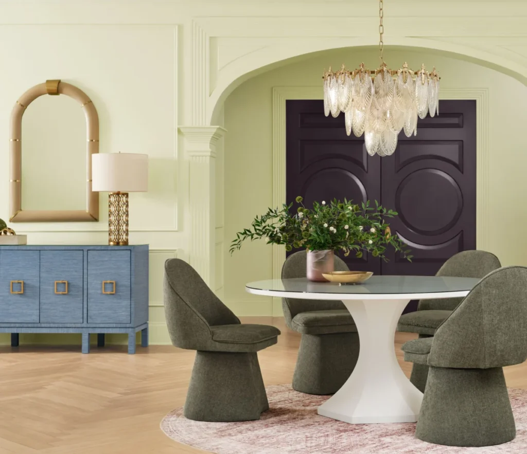

The paint and coatings industry serves as a primary barometer for shifting consumer sentiments in home design, and the latest announcement from Sherwin-Williams signals a definitive departure from the muted, monochromatic palettes that have dominated the post-pandemic era. On the heels of extensive global research, the company has officially declared Celery—a vibrant, light green with subtle yellow undertones—as its 2027 Color of the Year. This selection marks a strategic pivot toward organic, high-energy hues, challenging the long-standing preference for safe neutrals like greige and soft whites that have historically mitigated the risks associated with interior renovation.
The Evolution of Green in Interior Design
To understand the significance of Celery, one must examine the trajectory of green as a design staple over the last decade. During the early 2020s, the market was saturated with deep, moody emeralds and sage greens, often utilized to ground spaces and provide a sense of biophilic tranquility. However, as interior design trends shifted toward personal expression and "maximalist" minimalism, these darker shades began to feel heavy.

The 2027 selection represents what industry experts call a "visual exhale." Unlike its predecessors, which focused on creating enclosed, fortress-like comfort, Celery is designed to be kinetic and light. It functions as a bridge between the botanical inspiration of the past and a new, more optimistic aesthetic that emphasizes brightness and architectural clarity. By choosing a shade that leans into a yellow base, Sherwin-Williams is leaning into the psychological concept of "chromatic joy," which has been gaining traction in behavioral design studies as a way to counteract the fatigue associated with sterile, all-neutral environments.
The Colormix 2027 Trend Forecast
Celery is not merely a singular color choice; it is the cornerstone of the broader Colormix 2027 Trend Forecast, a comprehensive palette of 48 distinct shades categorized to assist both professionals and DIY homeowners. This year’s forecast is divided into segments that range from the high-contrast intensity of bright pinks like "Grenadine" and "Forward Fuchsia" to the grounding influence of blues like "Honorable Blue" and "Secret Garden."
The inclusion of 10 "continuity colors" within the collection is a calculated move to provide design guardrails for the average consumer. These neutral anchors allow homeowners to integrate bolder, experimental colors without compromising the structural cohesion of their living spaces. The strategy reflects a shift in market data: consumers are increasingly willing to experiment with color but require professional-grade frameworks to ensure that their investment in paint leads to a cohesive, rather than chaotic, result.

Strategic Insights from Industry Experts
The decision-making process for the Color of the Year involves a multidisciplinary team of color strategists, psychologists, and interior designers. Sue Wadden, the director of color marketing at Sherwin-Williams, notes that the transition to Celery is a response to a growing desire for usability in design. "This is a different interpretation that is softer and more usable," Wadden explained during the launch. "It is herbaceous, but not super bright. I think people are going to be excited by the challenge of how to use it."
Emily Kantz, a prominent interior designer and color strategist for the brand, emphasizes that the 2027 forecast moves away from the "curated perfection" seen on social media platforms. Instead, the focus has shifted toward "narrative-driven design," where color is used to tell a story about the resident. "We are seeing people create spaces that tell a story about who they are and how they want to live," Kantz stated. This evolution is supported by recent consumer data suggesting that homeowners are prioritizing personalization over resale value when making home improvements.
Practical Application and Spatial Impact
One of the primary concerns for homeowners when selecting a new color is how it interacts with natural light. Because Celery possesses a distinct yellow undertone, it is highly reactive to light conditions. For northern-facing rooms, where light is often cooler and bluer, the yellow in Celery provides a warming effect that prevents the room from feeling clinical.

Designer Corey Damen Jenkins, a collaborator in the launch, notes that the color offers significant versatility. "As a foundation, it offers real versatility. It can anchor a palette without overpowering it," he says. This makes it an ideal candidate for "color-drenching"—the practice of painting walls, trim, and ceilings in the same shade to create an immersive, unified aesthetic. Even for those hesitant to paint an entire room, the forecast suggests that applying Celery to kitchen islands, entryways, or interior built-ins provides a significant visual impact with minimal risk.
Data-Driven Shifts in Consumer Behavior
The shift toward bolder, more expressive colors is backed by a noticeable change in consumer buying habits. Over the past 24 months, retail analytics within the paint sector have shown a 15% increase in the purchase of "accent" colors compared to the previous five-year average. This data points to a broader trend: homeowners are no longer viewing paint as a static backdrop but as an active component of their emotional environment.
The 2027 trend forecast also addresses the "tension of contrast," a design principle where grounded, traditional tones are placed alongside vibrant, modern hues. The juxtaposition of a deep, traditional color like "Roycroft Bronze Green" or "Midnight" with a playful pop of "Lotus Petal" or "Jadite" allows for a sophisticated layering of textures and finishes. This is a direct reaction to the "fast furniture" and "cookie-cutter" design trends that have dominated the market, with consumers now seeking a "curated, expressive, and uniquely intimate" home atmosphere.

Implications for the Future of Design
The selection of Celery as the Color of the Year serves as a microcosm for the future of interior architecture. It reflects a move toward resilience, where the home is expected to be a place of both productivity and restorative calm. By promoting colors that evoke nostalgia—such as "Trinket," a mustard yellow, and "Dutch Tile Blue"—Sherwin-Williams is tapping into the psychological comfort of the past while simultaneously encouraging the boldness required for future-forward living.
For the residential real estate market, this trend indicates that the "all-white-everything" era is reaching a saturation point. As property owners prepare for the next phase of interior updates, the move toward warmer, more complex greens suggests a return to naturalism, but with a refined, modern edge.
Ultimately, the 2027 forecast is an invitation. As Kantz summarizes, "Color influences mood, shapes our experiences, and helps create meaningful connections to the places we spend the most time. Colormix 2027 is an invitation to embrace that potential and to design with intention, creativity, and confidence." Whether through a full-room overhaul or a subtle update to a piece of furniture, the introduction of Celery into the domestic sphere represents a significant, yet manageable, step toward a more vibrant and intentional way of living. As the industry looks toward 2027, the focus remains clear: the home is an essential vessel for personal expression, and paint remains the most effective, accessible tool for that transformation.