
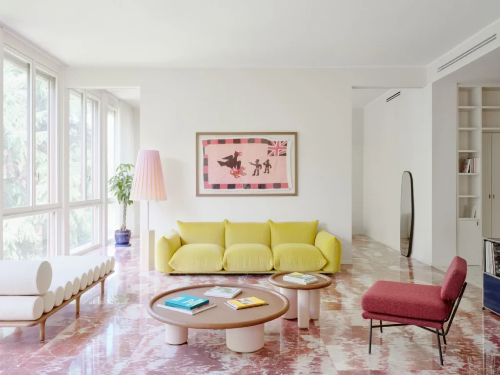

In the dense urban fabric of Milan, a city globally recognized as the epicenter of industrial design and avant-garde fashion, the interior of a residence can serve as a profound sanctuary against the monochromatic bustle of metropolitan life. A recent project by the local architecture firm Valencia Biscottini has garnered significant attention for its sophisticated handling of color and heritage materials. Situated in the heart of the city, this apartment has undergone a comprehensive renovation that rejects the stark minimalism common in contemporary urban developments, opting instead for a palette that evokes the perennial optimism of spring. The design logic of the entire residence is anchored by a single, preserved architectural element: an original Rosso Francia marble floor.

The Rosso Francia Foundation and Material Heritage
The renovation began not with a blank slate, but with a commitment to the "genius loci" of the existing structure. The Rosso Francia marble, characterized by its deep, earthy red hues and distinctive white veining, was the primary catalyst for the project’s aesthetic direction. Quarried predominantly in the Languedoc region of France, this marble has historically been used in prestigious European architecture, from the Palace of Versailles to high-end Milanese entries of the mid-20th century. By preserving this floor, Valencia Biscottini principals John William Valencia and Giuseppe Biscottini established a dialogue between historical substance and modern chromatic theory.

Rather than allowing the intense red of the marble to dominate the space in a traditional, heavy-handed manner, the firm utilized it as a foundational "neutral" against which a series of soft pastels could be layered. The result is a residence cloaked in shades of canary yellow, sky blue, and muted pink—a combination that the architects describe as a "positive vibe" achieved without the need for artificial enhancement.

Chronology of the Renovation Process
The transformation of the apartment followed a rigorous programmatic timeline, moving from structural preservation to bespoke material integration and finally to the curation of iconic design objects.

- Preservation and Restoration: The initial phase involved the careful restoration of the Rosso Francia marble in the main living areas. This required specialized polishing techniques to revive the stone’s natural luster while ensuring the integrity of the original slabs.
- The Terrazzo Intervention: To extend the chromatic narrative into the hallways and kitchen, the firm commissioned a custom terrazzo floor from Fantini Mosaici. This new installation was engineered to include fragments of the same Rosso Francia red, embedded within more earthen, neutral tones. This created a visual bridge between the old and new sections of the home.
- Spatial Reconfiguration: The entry sequence was redesigned to prioritize multi-functionality. High-performance cabinetry was installed, finished in the same material as the walls to create a seamless, monolithic appearance. This architectural "sleight of hand" hides a small guest bathroom, which features richer crimson accents—a direct nod to the floor’s intensity.
- Luminous Calibration: The final stages focused on lighting and furniture. The architects selected a range of fixtures that would complement the shifting natural light. As daylight moves across the beige walls, the surfaces transition toward soft pinks, a phenomenon planned to maximize the apartment’s "springlike" atmosphere.
Materiality and the Intersection of Nature
A key objective for Giuseppe Biscottini was the integration of the exterior landscape into the interior experience. Milanese apartments often struggle with a sense of enclosure; however, this residence utilizes large, floor-to-ceiling windows that wrap around the living room to pull the surrounding greenery into the home’s color scheme.

The material palette shifts as one moves from the public to the private spheres. While stone and terrazzo define the high-traffic areas, the bedrooms feature Italian herringbone oak parquet. This transition is not merely aesthetic but tactile, moving from the cool, hard surfaces of the social areas to the warm, organic feel of wood in the resting quarters. The use of golden, natural tones in the wood cabinetry further grounds the spaces, mimicking the effect of filtered sunlight.

A Curated Anthology of Italian Design
The apartment serves as a showcase for high-level European design, featuring a selection of furniture and lighting that reads like a retrospective of modern design history. The choice of objects was dictated by the "Easter egg" palette established by the architects.

- Living Room: The space is anchored by a Marenco sofa by Mario Marenco for Arflex, a piece known for its voluptuous, cloud-like cushions. This is paired with Elettra armchairs, designed by the legendary B.B.P.R. studio (Gian Luigi Banfi, Ludovico Belgiojoso, Enrico Peressutti, and Ernesto Nathan Rogers). The inclusion of B.B.P.R. is significant, as the firm was instrumental in shaping Milan’s post-war architectural identity.
- Dining and Lounge: A Pluto coffee table by Studiopepe for Tacchini and a Five to Nine daybed (also by Studiopepe) add structural rigor. The dining area features a Karakter table and chairs, illuminated by a Koinè light fixture by Mandalaki Studio for Luceplan.
- Storage and Utility: In the entryway, an iconic modular console by USM Haller provides a sharp, industrial contrast to the soft colors of the walls.
- Lighting: The apartment features an extensive lighting program including LP6 wall sconces by Ignazio Gardella for Azucena, Berlin ceiling lights by Christophe Pillet for Oluce, and pieces from Servomuto’s Haute Couture and Giardino collections.
Technical Analysis: Color Drenching and Chromatic Balance
The bathrooms represent a masterclass in the contemporary "color drenching" trend. Using the Pico tile collection designed by Ronan & Erwan Bouroullec for Mutina, the architects enveloped one bathroom in pink and the other in blue. This technique involves using a single color across multiple surfaces to create a sense of immersion and serenity. The fixtures in these spaces, including Gio Ponti-designed pieces by Mamoli, reinforce the connection to Milan’s architectural heritage.

From a design perspective, the success of the renovation lies in its "slow reveal." The colors are not aggressive; rather, they unfold as the inhabitant moves through the space. The beige walls are not static; they are reactive surfaces that change with the sun’s position, moving through the spectrum of the apartment’s chosen palette. This dynamic environment reflects a shift in luxury residential design away from ostentation and toward atmospheric well-being.

Broader Implications and Design Trends
The Valencia Biscottini project highlights several emerging trends in the high-end European residential market. First is the "New Heritage" movement, where historical elements like the Rosso Francia floor are not just saved but are used as the primary creative constraints for a modern intervention. This approach is increasingly favored in cities like Milan, Paris, and London, where original architectural details add significant market value and character.

Second is the focus on "Biophilic Chromaticism." While biophilic design usually refers to the physical presence of plants, this project demonstrates how color and light can be used to simulate the psychological effects of nature. By utilizing a "springtime" palette, the architects have created an interior that counters the "grayness" often associated with Milanese winters.

Finally, the project underscores the importance of the "Total Work of Art" (Gesamtkunstwerk) philosophy in interior design. Every element—from the custom-poured terrazzo by Fantini Mosaici to the specific bolster cushions of the Studiopepe daybed—is part of a singular, unified vision.

Conclusion
The renovation of this Milanese apartment by Valencia Biscottini stands as a sophisticated example of how heritage and contemporary design can coexist. By taking a single historical element—the Rosso Francia marble—and extrapolating a complete chromatic world from it, the firm has created a space that feels both timeless and remarkably fresh. It is a residence that doesn’t just house a collection of design icons; it creates a specific, curated atmosphere where color, light, and material work in delicate balance to provide a permanent sense of spring within the urban landscape. As the natural light shifts and the beige walls turn to pink, the apartment reveals itself as a living, breathing entity, deeply rooted in its Milanese context while looking forward to a brighter, more colorful future in residential architecture.